The Project
This case study showcases my work designing an interface for a data company's website. In this article, I will walk you through my creation process, which includes the following key elements:
- Competitive Research: I conducted thorough research within the tech field to understand effective communication strategies and familiarize myself with design best practices.
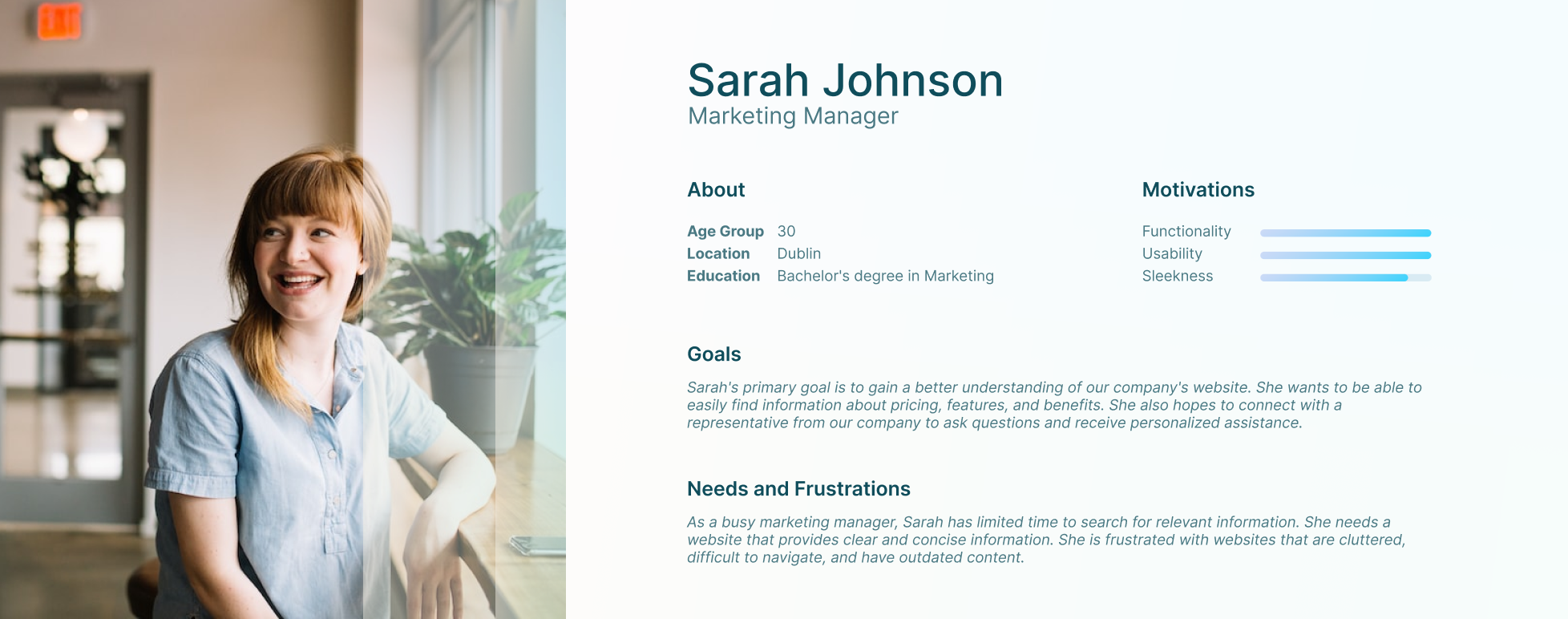
- User Research: I conducted surveys among peers with expertise in this sector to gain valuable insights into user expectations within the industry. The survey results were analyzed to create a specific user persona to improve the architecture of the information and user journey through this project to make sure the goals to attend to their need would be met.
- Prototyping: With the content for the webpage defined, I initiated the prototyping phase. This involved the creation of low-fidelity wireframes, user stories, and stylings. After selecting a stable version, I conducted a user test to gather feedback and insights for further improvements. This feedback played a crucial role in developing a high-fidelity prototype I present to you here today.
Research
The user persona created in this project helped me to stay user-centric to ensure the best user experience could be achieved with my design.

Ideation and Wireframing
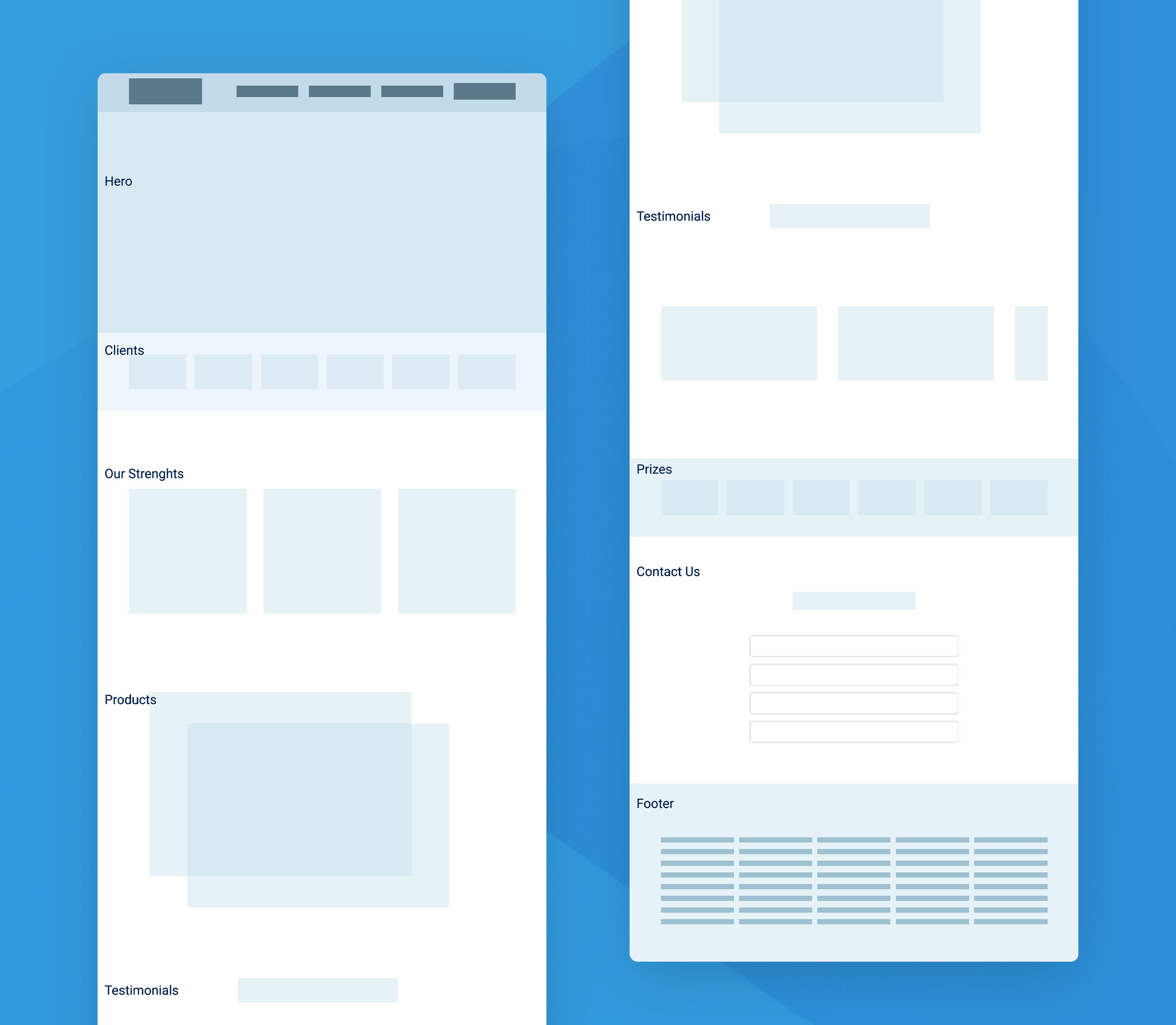
Wireframing this content helped me to come to a decision on where and how things should be displayed on the page and the best order for it. Please see the final version of my low-fidelity wireframe below.

Design System
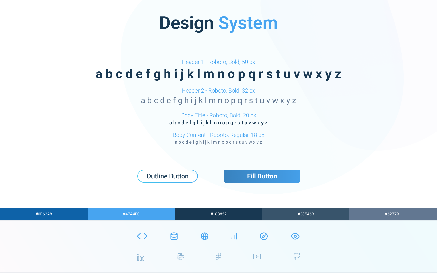
Defining the stylings and guidelines for this project with a design system helped me to keep it consistent and aligned with the brand.

High Fidelity Prototypes and Testing

Project Achievements
The high-fidelity prototypes presented here are the result of dedicated work aimed at achieving a top-tier design. The primary objectives were to effectively represent the brand, and convey the business message, intuitively, and in an attractive manner. Also prioritise usability, implementing a concise and carefully considered navigation system to make sure it is straightforward and tailored to what users need most.
Interactive Prototype
See below the interactive prototype in Figma