The Project
In this article, I bring to you the process of developing an analytics dashboard for athletes of any level that want to keep track of their performance in order to continue progressing forward towards their goals.
The challenge in this project is to make the data visualisation clean and clear so the users don't feel confused and overwhelmed by the amount of information displayed.
The main goal is to get the data on the athlete's performance understandable by users with any level of knowledge on data analysis.
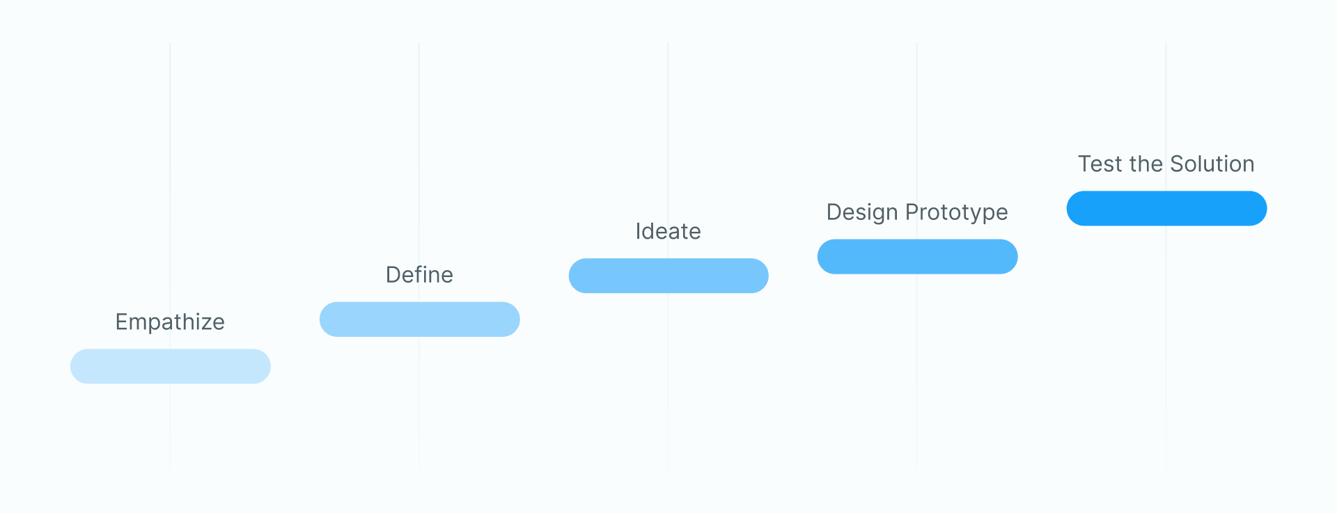
Methods: Surveys, Interviews, User Journey, Affinity Mapping, Competitive Audit, Wireframes, Prototyping
Tools: Figma, Google Forms and Google Sheets for the Surveys
The Process
We currently have quite a few options when it comes to sports tracking, so for this project, I reached out to users who are familiar with them to understand their frustrations and find the gaps to be filled in order to provide a clear and understandable analytics dashboard for any level of the athlete with or without experience with analytics.
Analytics dashboards can be overwhelming when you are not used to them, so I aim to make this dashboard more understandable and approachable.
For that, I have applied the data storytelling technics breaking down the content and introducing the user to the information in a light and inciting way guiding them to a more detailed presentation.
For the design, I got inspiration from other sports trackers so the users could be familiar with my dashboard and find their way around easier making the experience a lot better for them.
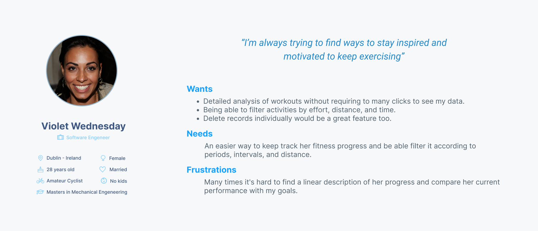
Research
The user research for this project was done with surveys and analysis of user reviews on products in the same segment.
Many users were frustrated with the challenge to understand the data and know whether they were having any progress after putting effort into practising a determined sport.
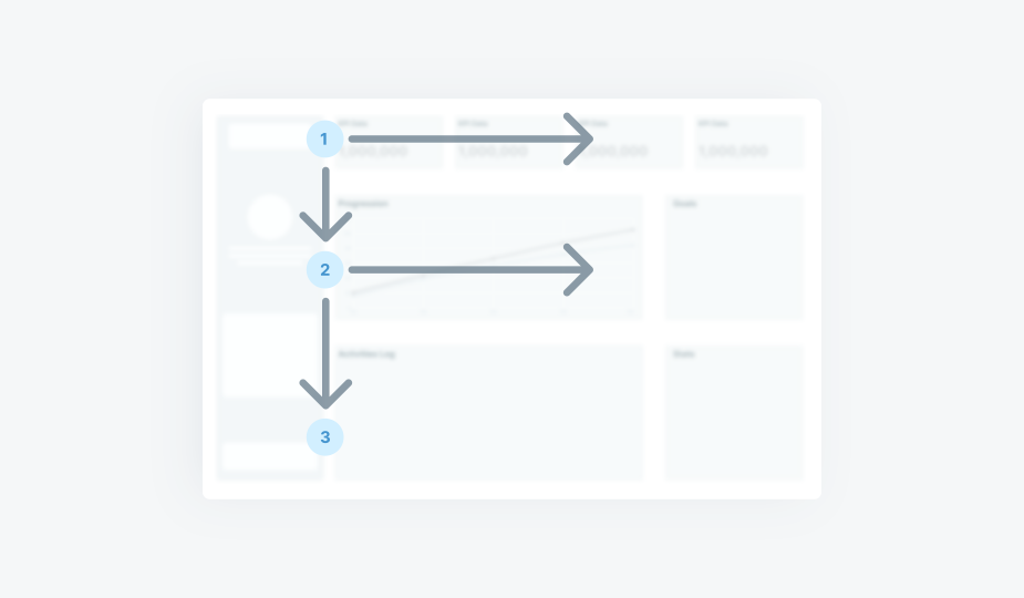
User Journey
Data Storytelling
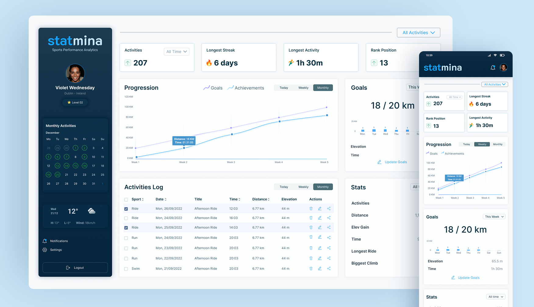
In order to provide better visibility of performance trends, the content has been broken down into KPIs, graphs and tables.
Considering the most common way of web reading is the "F" pattern, I bring the main KPIs right on the top of the page to indicate how is the user progressing towards their goals, and as the user keeps scanning the page down they will be able to analyse the performances in a more granular way and make the best decisions on what to do to improve her performance and achieve her goals.
To make the readability of the content easier all the similar or inter-related content was grouped up together, with that the user doesn't need to go back and forth trying to find the information they need.
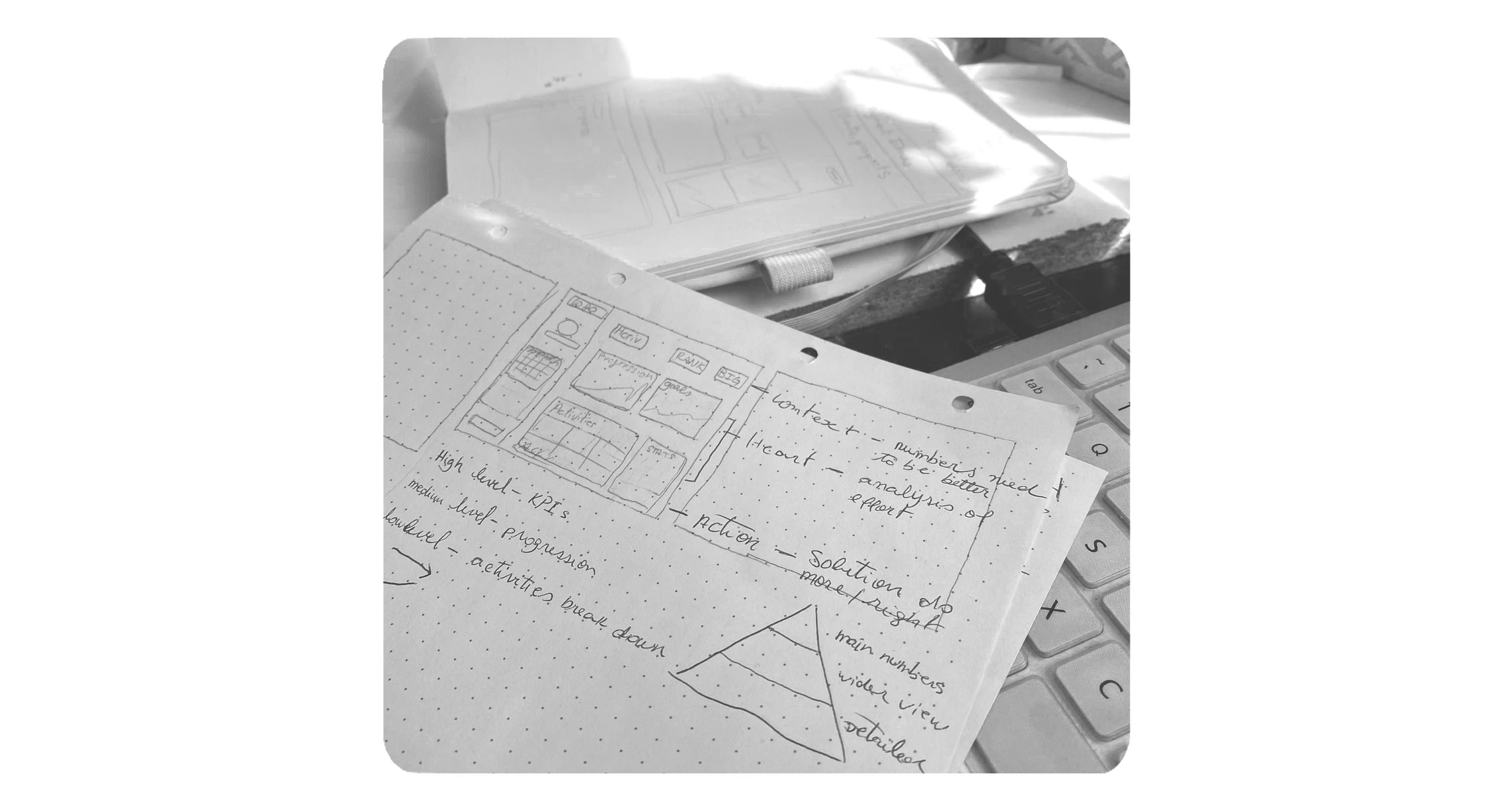
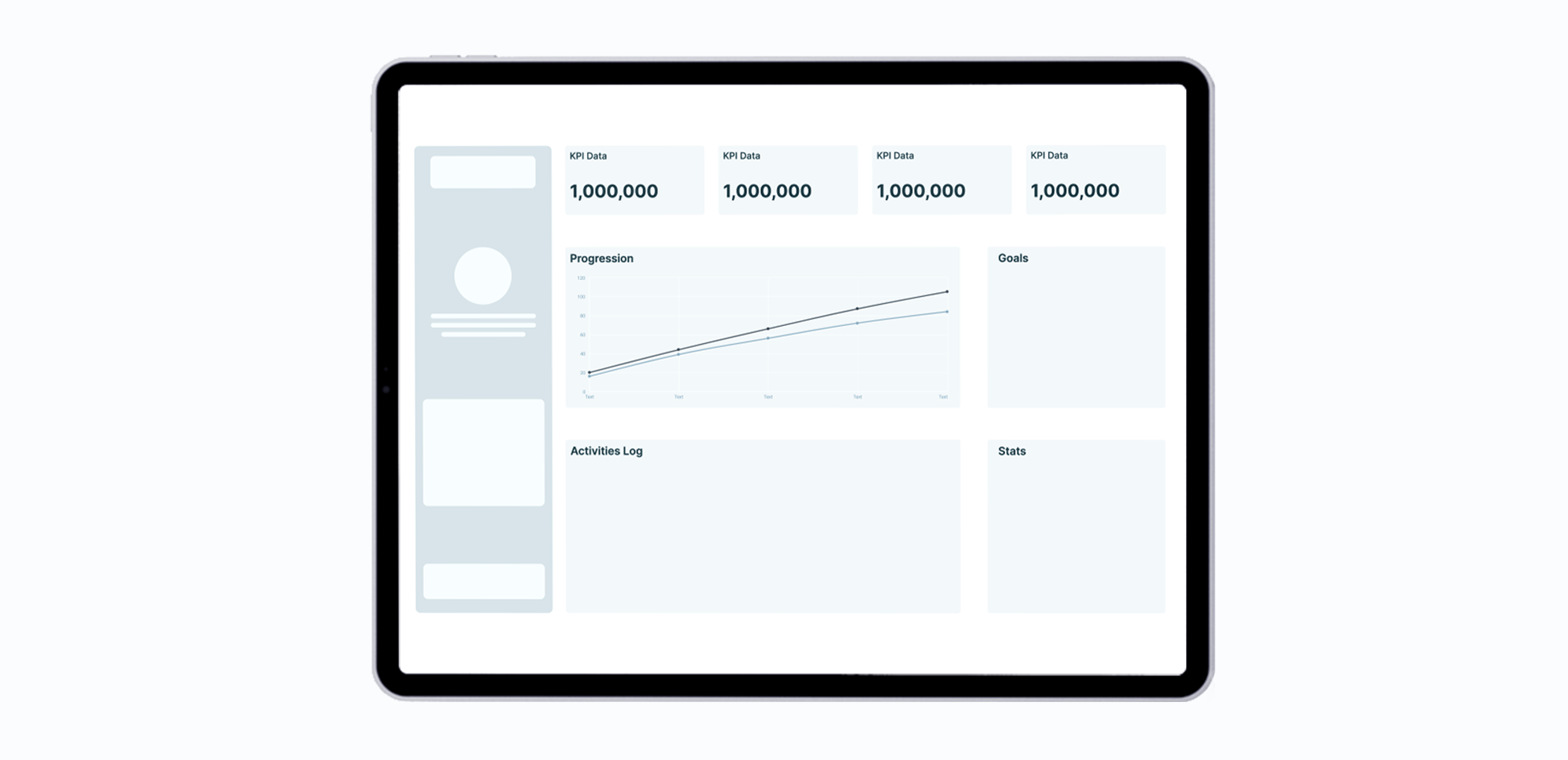
Ideation and Wireframing
Wireframes are the best way to brainstorm ideas to solve a problem with a visual cue. Based on the first users' feedback I started drafting ways to structure the information on the dashboard in a way that could make the most sense to the user. The idea was to guide them through the information so they could make the most of it.
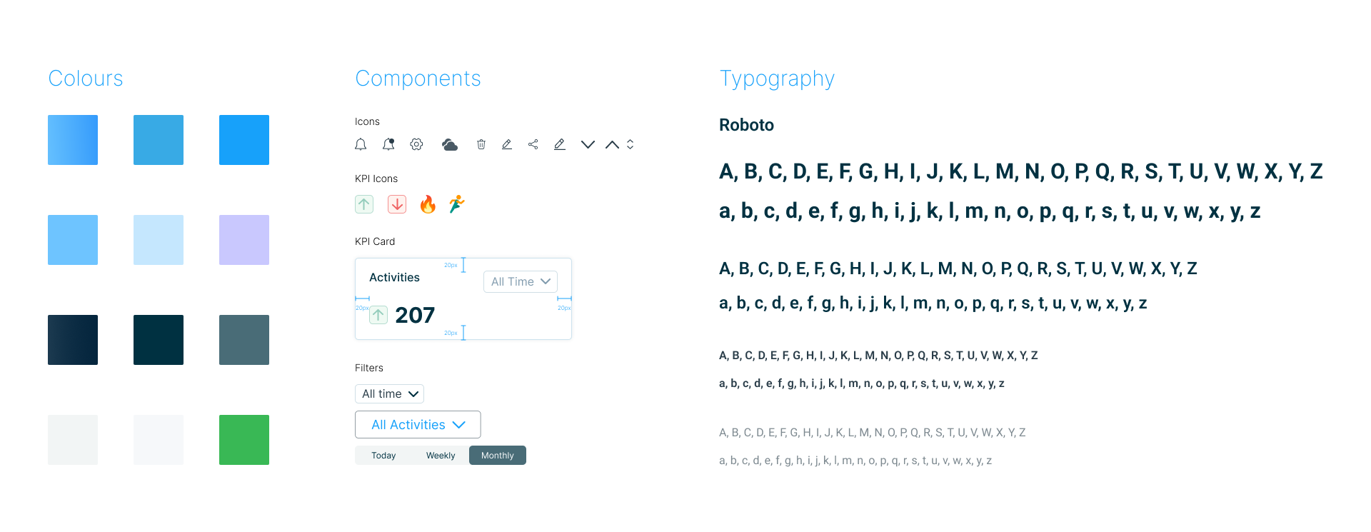
Design System
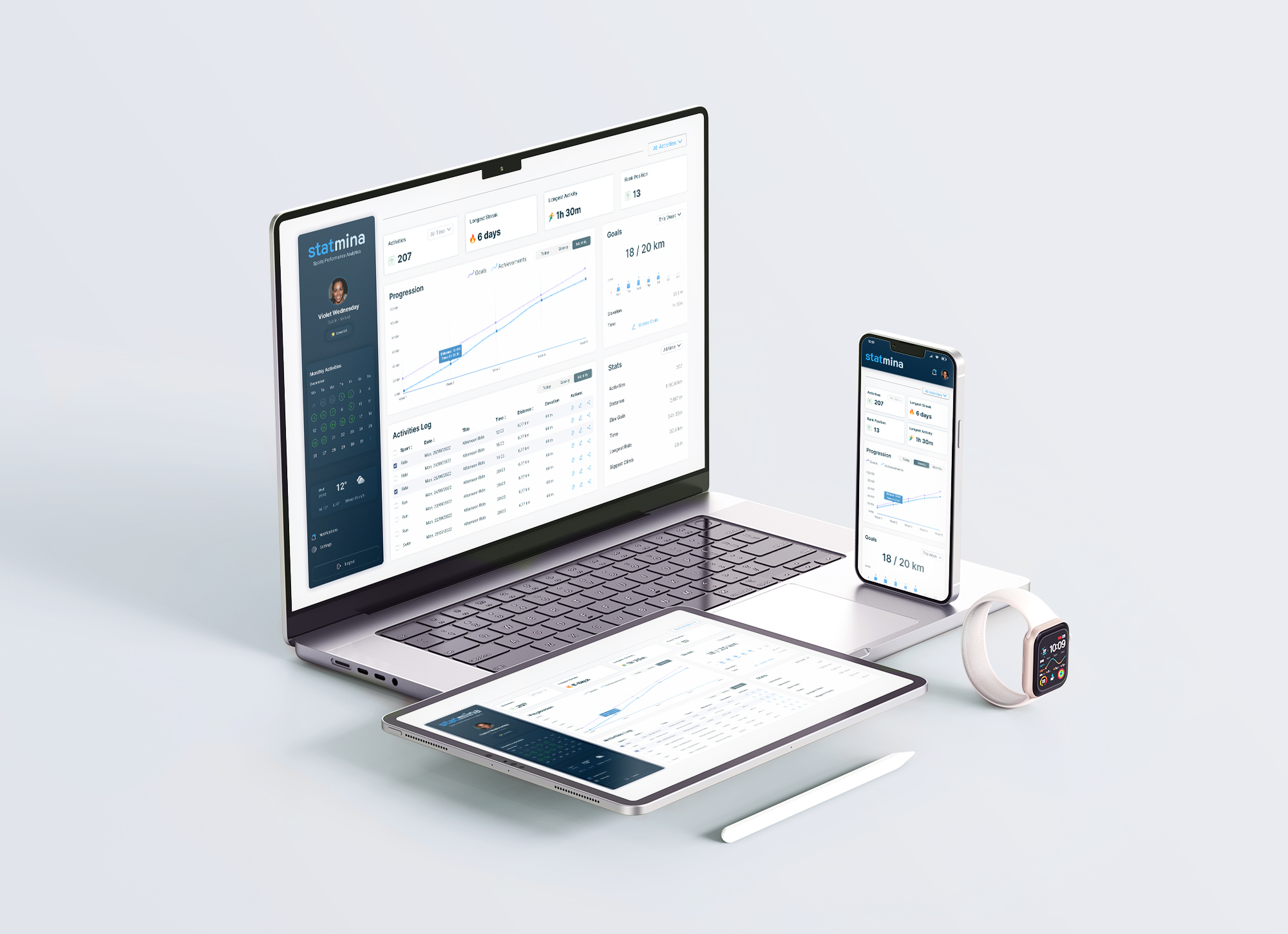
High Fidelity Prototypes and Testing
The prototype was developed based on user surveys and according to the brand's identity.
Interactive prototypes are a way to try and test the interaction of the user with the product without requiring long-term commitments and getting the answers we need in order to develop the solution.
Here I bring to you the interactive prototype for the mobile version of the dashboard that you can give a go.
Interactive Prototype
See below the prototype you can interact with.